Popular Articles
Ultimate Guide to 360° Comprehensive Interior Detailing — Deep Clean, Sanitize and Protect Your Car’s Cabin
2026.02.04
Singapore Car Window Tinting Guide: Rules, Benefits, and How to Choose the Right Film
2026.02.04
The Complete Guide to Colour Wraps — Transforming Your Car’s Look with Style and Protection
2026.02.04

About Company
Colorfuul is a global leader in high-end automotive films, offering Color TPU PPF, Transparent PPF, PET Window Films, and Vinyl Wrapping. With exports to over 100 countries, we deliver consistent quality, competitive pricing, and professional service. Beyond production, we provide OEM/ODM customization, shaping the future of automotive aesthetics.
 mary@colorfuul.com
  86 13541196952
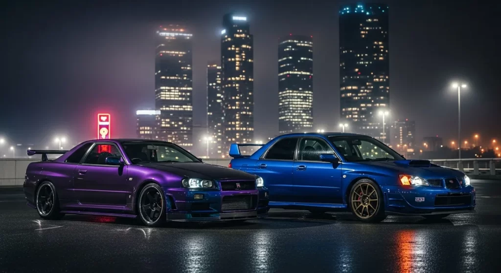
 Midnight Purple vs Midnight Blue: Color Comparison & Visual Tips
he difference between Midnight Purple and Midnight Blue lies in their primary pigment base, with the former utilizing deep violet and red undertones to create a shifting appearance, while the latter relies on a charcoal-infused blue base that remains more visually consistent. You will find that these two colors are often confused because they both share a "near-black" profile in low-light environments, making their unique identities difficult to distinguish without direct illumination.
What Is Midnight Purple?
Midnight Purple color is a deep, multidimensional shade of violet that sits at the furthest edge of the visible spectrum before transitioning into total blackness. You should think of it as a "hidden" color; it maintains a stealthy, neutral presence in the shade but reveals a vibrant, metallic-like violet glow once struck by light.
This dark purple shade is achieved by layering rich violet pigments over a dark charcoal or indigo foundation. This combination creates a "cool" temperature that feels sophisticated and expensive. Unlike a standard royal purple, Midnight Purple is designed to be highly reactive. It doesn't just look purple; it behaves like a living finish that responds to the environment, moving between deep plum, charcoal, and electric violet depending on your viewing angle.
What Is Midnight Blue?
Midnight Blue color is an extremely dark shade of blue that is meant to mimic the appearance of the night sky under the light of the moon. You will notice that it is significantly darker than navy blue, often appearing nearly black until you observe it under a bright, direct light source.
This dark blue shade is created by mixing deep indigo with black and occasionally a touch of grey. The goal of Midnight Blue is to provide a sense of vastness and depth without the stark, flat nature of pure black. While it is a cold color, it possesses a professional and stable quality. It does not typically "shift" into other colors; instead, it maintains its blue identity, simply becoming more or less visible depending on the intensity of the light available.
Why Are Midnight Purple and Midnight Blue Often Confused?
Midnight Purple and Midnight Blue are frequently mistaken for each other because they both occupy the same low-brightness space on the color spectrum, appearing as a deep, saturated neutral in the absence of light. You will find that at night or in a dimly lit garage, both colors absorb enough light to hide their true hue, making them both appear as a "soft" version of black.
The confusion also stems from their shared use of blue undertones. Because Midnight Purple often contains blue pigments to anchor its dark base, your eyes may perceive the cool blue tones before the violet highlights become visible. In low-light photography, digital sensors often struggle to separate these deep frequencies, further blurring the line between a dark purple vs a dark blue. You essentially have two colors that use "darkness" as their primary mask, revealing their secrets only when the sun or a spotlight hits the surface.
How Do Midnight Purple and Midnight Blue Compare Visually?
The two colors differ visually despite their similarities, as the warmth of the purple pigments creates a much more dynamic and "energetic" look compared to the steady, cold presence of the blue. You can distinguish them by looking for the "temperature" of the highlights—purple will lean toward a reddish-violet, while blue will remain squarely in the indigo or teal family.
| Aspect | Midnight Purple | Midnight Blue |
| Primary Base | Deep Violet / Black | Indigo / Charcoal |
| Undertones | Blue and Magenta | Grey and Navy |
| Temperature | Cool with warm highlights | Consistently Cold |
| Visual Character | Dynamic / Reactive | Stable / Understated |
You notice that midnight purple vs midnight blue is a battle between "motion" and "stillness." Midnight Purple feels like it is moving across the surface as you walk by, whereas Midnight Blue feels deep and stationary. The purple version provides a high-contrast experience, while the blue version offers a smooth, gradient-like transition that feels more integrated into the dark base.
How Do These Colors React to Different Lighting Conditions?
Lighting strongly affects both colors, serving as the "on/off" switch for their true identities and dictating how much of the underlying pigment is visible to the eye. You will find that without light, these colors are essentially indistinguishable, but they react in completely different ways once the environment changes.
Lighting scenarios and their effects:
- Direct Midday Sun: Purple becomes a vibrant, saturated violet; Blue becomes a rich, crystalline navy.
- Overcast or Cloudy Skies: Purple looks like a moody plum or dark grey; Blue appears as a flat, professional charcoal-blue.
- Artificial Night Light (LED): Purple reveals sharp blue and magenta "pops"; Blue shows a deep, metallic indigo shimmer.
- Dusk/Twilight: Both colors recede into a "soft black" silhouette, often hiding their hue entirely.
You find that midnight purple lighting is much more transformative. You can go from a "stealth" look to a "show" look in seconds. Midnight blue lighting is more predictable; it simply gets brighter or darker while staying true to its primary blue identity.
Is Midnight Purple More Color-Changing Than Midnight Blue?
Midnight Purple appears more color-changing because its pigment structure often includes "interference" particles that cause light to bounce off the surface at different frequencies, whereas Midnight Blue is a more "static" pigment. You see this manifest as an optical illusion of depth, where the purple seems to "flip" between violet, blue, and black.
In a midnight blue vs purple comparison, the purple is the "chameleon." The perceived color-shift is a result of the blue and red undertones competing for visibility. When you walk around a purple car or object, your eyes see the red highlights on the curves and the blue highlights in the shadows. Midnight Blue doesn't have this internal competition; it is a harmonious blend of dark tones that stays within the blue family regardless of your viewing angle. So, if you want a color that feels "alive," purple is the definitive choice.
How Does Midnight Purple Pearl Compare to Midnight Blue Finishes?
Finishes affect how each color appears by dictating the way light is reflected or absorbed by the surface layers. You will find that a "Pearl" finish on a purple base creates a much more liquid, three-dimensional look than a standard metallic blue finish.
| Finish Type | Visual Depth | Light Reflection | Overall Effect |
| Midnight Purple Pearl | Extreme | Soft / Internal Glow | Shifting and "Liquid" |
| Midnight Blue Metallic | High | Sharp / Sparkle | Consistent and Crisp |
| Midnight Blue Gloss | Moderate | Mirror-like | Deep and Professional |
You find that Midnight Purple Pearl utilizes translucent mica to allow light to penetrate the surface, making the color look like it is coming from within the paint. A midnight blue finish is typically more "on the surface." It uses metallic flakes to catch the light on the top layer, providing a sharp sparkle but without the "bottomless" sensation that you get with the pearl-infused purple.
What Emotional or Psychological Feel Do These Colors Convey?
The two colors evoke different emotions, with purple leaning toward creativity and mystery, while blue projects a sense of stability, trust, and calm. You will find that your choice of color often reflects the personality you want to project—one is a bold statement of individuality, the other is a hallmark of sophisticated professionalism.
In the world of midnight purple meaning, you find associations with the elite, the mysterious, and the artistic. It is a "boutique" color that suggests a high level of customization. In contrast, midnight blue meaning is tied to reliability and depth. It is the color of the deep ocean or the vast sky, suggesting a person who is grounded, serious, and classic. You notice that purple "vibrates" with energy, while blue "rests" with authority.
When Does Midnight Purple Make More Sense Than Midnight Blue?
Each color suits different contexts, and you should choose based on whether you want your project to be a conversation starter or a display of quiet, refined taste.
- Expressive Builds: Purple makes more sense for show cars or creative projects where the "wow factor" of a color-shift is the goal.
- Understated Elegance: Blue is the better choice for luxury daily drivers or professional branding where you want to remain low-key but premium.
- Complex Body Lines: Purple highlights curves and vents better by creating higher-contrast shadows.
- Timeless Longevity: Blue is less likely to feel "trendy," maintaining a classic look that never goes out of style.
- Personal Expression: If you want to signal that you are an "outsider" or a creative, purple is the visual shorthand for that identity.
Is One Color Objectively Better Than the Other?
Neither color is objectively better, as the "best" choice is entirely subjective and depends on your personal aesthetic goals and how much you value visual drama. You should view midnight purple vs midnight blue as a choice between two different philosophies of "darkness."
One is a theatrical color that uses light to reveal a complex, shifting violet soul. The other is a foundational color that uses depth to provide a sense of calm and permanence. You find that they both succeed in moving away from the boredom of standard black. Whether you prefer the "energetic" violet or the "stable" indigo, you are choosing a color that rewards the viewer for taking a closer look.
How Is Midnight Purple Defined as a Color?
Midnight Purple is a deep, complex purple shade that sits at the intersection of dark violet and charcoal black. To understand the technical roots of this color, you can explore the Midnight Purple Color definition, which explains how low-frequency light waves and specific pigment densities create that "near-black" effect. It is a shade that relies on "depth" rather than "vibrance" to make its impact.
Is Midnight Purple Actually a Color-Changing Shade?
Midnight Purple appears to change due to lighting, but it is technically a "reactive" color rather than a true chameleon pigment. As noted in the discussion of whether Is Midnight Purple Color-Changing, the effect is based on "angle-dependency." The actual pigments do not change, but the way your eye perceives the light bouncing off the dark base creates a shifting violet-to-black gradient that feels alive and moving.
What Makes Midnight Purple Pearl Visually Different?
Midnight Purple Pearl adds a reflective effect by using translucent mica flakes that allow light to penetrate the surface and reflect from within. This is why Midnight Purple Pearl is so desirable for high-end builds; it provides a softer, more "glowy" look than a standard metallic. It is the perfect choice if you want your project to have a premium, "one-of-one" feel that looks like a high-end show car.
Why Is Midnight Purple Considered a Pillar Color?
Midnight Purple anchors many design interpretations because it has remained at the top of the desirability list for over thirty years. According to the Midnight Purple, a pillar color is one that remains commercially and stylistically relevant across decades. It is a reliable, high-intent color that fashion houses and beauty brands return to every year because it consistently resonates with the human desire for elegance and mystery.
Final Thought
Choosing between Midnight Purple and Midnight Blue is a decision to embrace the shadows. It is about finding a way to be dark without being plain. If you want a color that changes with the sun and hides in the night, purple is your path. If you want a deep, stable color that feels like the infinite sky, blue is your home.


